
The Evolution Of Canadian Home Prices: Affordability, Interest Rates, And The Generational Homeownership Cycle
Canadian House Price Appreciation And Interest Rates
The Canadian housing market has been a hot topic of conversation for years, with booming house prices, gyrating interest rates, and a broader concern over affordability. In this article, in addition to pointing out the general topics of unaffordability and rising house prices, we also want to study past levels of affordability compared to today, and how generational buying waves have played an important role. In the sections following, we will be examining a series of charts that analyze housing growth rates, inflation-adjusted affordability levels, generational buying cycles, and a shift in debt priorities.
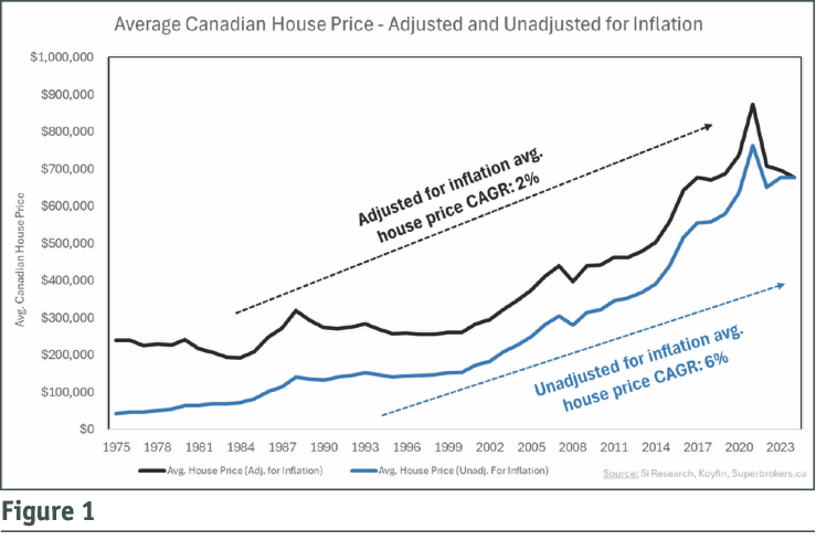
Figure 1 shows the average cost of a Canadian home since 1975, adjusted for inflation and nominal (not adjusted for inflation). For simplicity’s sake, the nominal average price of a home in 1975 was around $42,000, while the average cost in 1975 adjusted for today’s inflation would be $240,000. However, this does not consider mortgage rates, which we will address in the section further down. The average cost of a home today is just below $700,000.
One of the more interesting pieces to consider is the annualized growth rates. Most individuals may think that home prices, on average, should increase roughly by the rate of inflation (around 2% to 3% per year), but we can see that nominal prices have grown at a 6% annualized rate.
Looking at the inflation-adjusted annual growth rate provides more context, since after accounting for inflation, home prices have risen by about 2% each year. In other words, home price appreciation of 2% per year has been driven solely by an increase in demand.
In Figure 2 on the next page, we have overlaid the historical mortgage rates with the average cost of a home (adjusted for inflation) since 1975. Immediately, we can see the inverse relationship between the two. For this article, we have used the historical variable mortgage rate, as it has better-reflected rates over time. When mortgage rates sat at about 10% between 1975 and 1990, house prices were mostly flat. As rates started their descent below 10%, how house prices began to appreciate during that time.
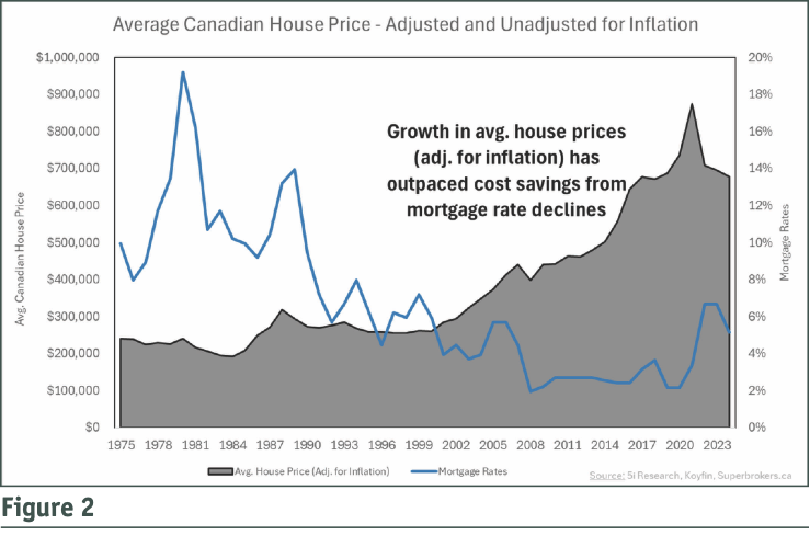
This relationship between mortgage rates and house prices forms part of the reason why house prices can appreciate faster than inflation. As mortgage rates decline, monthly mortgage payments become more affordable, thus house prices rise in response to this increase in affordability (increase in demand).
Inflation-Adjusted Mortgage Payments, Generational Buying Cycles, And Future Scenarios
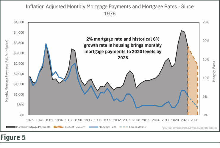
In this section, we dive into how affordable the housing market today is compared to history. To measure affordability, we have calculated what the monthly mortgage payments would be on the average cost of a Canadian house since 1976 (adjusted for inflation), using historical variable mortgage rates, assuming a 10% downpayment on the house, and a 25-year amortization period. This calculation gives us the inflation-adjusted monthly mortgage payment (black area graph) in Figure 3. We have also overlaid the mortgage rates (blue line) in that period.
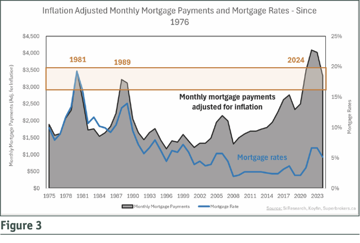
As we mentioned earlier, in 1975, the inflation-adjusted average home price was the equivalent of buying at $240,000 in today’s dollars. The caveat is that mortgage rates were 10%. When we consider these two factors, the monthly mortgage payment was the equivalent of spending $1,900 per month in today’s dollars.
As we progress through the years when mortgage rates spiked to nearly 20% in the early 1980s, and 14% in the late 1980s and early 1990s, the inflation-adjusted monthly mortgage payments are around $3,000 to $3,500, similar to that of today, even as house prices have skyrocketed in recent years. Today’s unaffordability levels of an average monthly mortgage payment of $3,500 are high, but we also saw these same levels of unaffordability in 1981 and 1989. At the surface, these three points in time may seem meaningless, but we believe there is a logical explanation which has to do with generational waves.
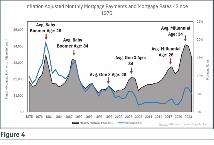
In Figure 4, we show the same chart as Figure 3, but we outline where the average age of the Baby Boomer, Gen X, and Millennial generations were 26 and 34. Since most individuals within a generation tend to be concentrated within a few years, the average age for each generation becomes very important. This essentially outlines periods of a significant burst in demand, as most individuals in that generation are roughly the same age and are at similar points in life. The ages 26 and 34 have relevance in the data as each “peak” in unaffordability levels corresponded with these ages. For example, the average Baby Boomer was around 26 in 1981, and 34 in 1989, both areas of peak unaffordability for the housing market. The average Gen X was around 26 in 1999, and 34 in 2007, both areas where unaffordability spiked. Lastly, the average Millennial was 26 in 2015 and 34 in 2022, both instances of peak unaffordability. The logic is that at age 26, an individual has at least a few years of career experience, helping to support home ownership, and by age 34, individuals may have as much as 10 years in the workforce and are looking to grow their home to support a family.
Now the question is, where does housing affordability go from here, and when might the next wave of generational demand be coming? The average age of Gen Z is currently 21, which means the year 2030 is when they will reach the average age of 26, potentially sparking a wave of economic demand and growth.
However, over the next few years, if we assume that house prices rise at the historical average of 6%, and if mortgage rates decline to as low as 2%, we could see monthly mortgage payments decline to a level of around $2,500. This is still high relative to other times across history, but it would mark an improvement from today, while forecasting continued growth in the housing market. Of course, we can forecast this in many ways (projecting lower growth rates, higher mortgage rates, etc.) but we feel this captures a healthy level of potential outcomes.
A Shift In Debt Priorities
In this last section, to further validate the calculations and charts that we have created in-house, we wanted to “back-test” these figures by looking at the Canadian household debt servicing indicators from Statistics Canada. In Figure 6, the black line represents Canadian households’ ability to service their total outstanding debts (mortgage and non-mortgage-related debts). When it reaches a peak of 15, this has historically represented areas where Canadians have the most difficulty servicing their total debts (major instances being 2008, 2019, and 2023).
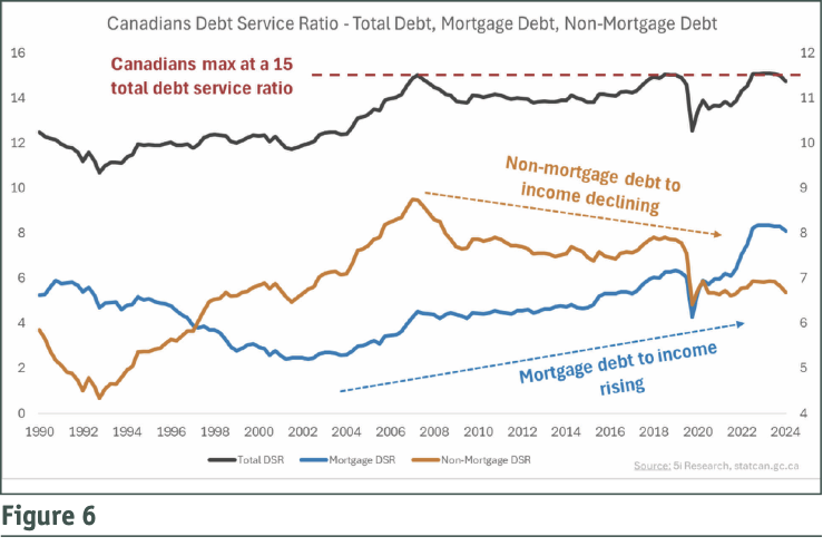
It is important to keep in mind that the black line represents Canadians’ ability to service their total debts, and while mortgage affordability was much better in 2008 and 2019 than it is today, the key is that Canadians have reduced their non-mortgage-related debts to fund mortgage-related debts. This can be seen in the orange and blue lines. Since 2008, we can see that the orange line (representing non-mortgage-related debt to incomes) has declined, while the blue line (mortgage debts) has risen. The combination of these two factors (mortgage debts rising while non-mortgage debts are declining) works out to the same level of total debt unaffordability as in 2008 and 2019. This effectively means that to service the rising monthly mortgage payments, Canadians are reducing, or not taking on as many, non-mortgage-related debts. This could mean less credit card debt, fewer car loans, less student debt, or fewer lines of credit.
Looking Ahead: The Future Of Homeownership And Affordability In Canada
The future is, and always has been uncertain, but given the historical trends in both house price appreciation and mortgage rates, we envision a path forward where Canadian housing affordability improves, even as house prices increase. While the housing unaffordability of today is at an extreme, looking back at history, we have seen these extreme levels of unaffordability before.
The reasoning for these few periods of spikes in unaffordability (1981, 1989, and 2023-2024) can all be traced back to major generational buying waves. The historical spikes in unaffordability of 1981 and 1989 did not last forever, and we suspect that neither will the current levels of unaffordability. Will we see the same levels of affordability that we saw between the mid-1990s and 2010 again? Perhaps not, but we can see that Canadians have been managing this period of high unaffordability with a reduction in non-mortgage-related debt, helping to stabilize overall debt serviceability.
While the rising house prices of the past above the rate of inflation were driven largely by a gradual reduction in mortgage rates from above 10%, we feel that given the starting point of rates today (around 5%), it may be challenging for house prices to appreciate much beyond the rate of inflation going forward.
Chris White, CFA, Head of Research for 5i Research Inc.